Designing food and drinks ordering app that utilizes a simple yet accurate pick-up system to ensure that users’ orders will always be ready exactly when they’re expected to be.
Under the guise of convenience, the reality of online ordering systems are frustrating when it comes to getting orders ready in a time-efficient manner.
Where You Bean gives you the confidence that your daily dose of caffeine will be ready exactly when you expect it (without all the hidden time-wasters).
GATHERING INSIGHTS
Where do frustrations lie within current online ordering apps?
I began my study by surveying five individuals (ages 21-27) to find out more about people’s preexisting relationships with online ordering systems and the obstacles standing between them and their cup of joe.
WHAT USERS ARE SAYING
“Ordering online saves a lot of time when there’s a line at the shop. It doesn’t save time, however, when I have to go through all the hassle of creating an account, putting in credit card info, double checking location, etc.”
- LARA, 24
“A lot of mobile apps don’t tell you the price of the modifications before you get to the cart so I never know what size I want and it’s annoying because I have to go back and adjust the size to whatever I can afford.”
- CHRIS, 22
“Usually the ETA is later than when the drink is actually ready and that results in the drink being less appetizing and I feel like my time has been wasted.”
- MARCUS, 27
“It gives me anxiety in not knowing where to pick up my drink when it’s ready or what to do, who to talk to, etc. when I happen to be late. I wish there was more clarity and less ambiguity.”
- LAUREN, 21
OVERARCHING THEMES
CHECK-OUT OPTIONS
Having the option to check-out as a guest is fundamental to online ordering apps.
CUSTOMER INFLUENCE
People highly value other customers’ feedback in influencing their own order choices.
AUTOMATION
Efficiency means being able to quickly re-order past drinks and auto-filling payment information.
LACK OF PERSONALITY
Most online ordering systems feel impersonal and lack the sense of priority towards customers.
STUDYING THE COMPETITION
What are other online ordering apps doing?
Once I had a better understanding of the users, the next step was to understand my competitors. Through competitive analysis, I discovered current apps’ strengths and weaknesses, as well as gaps and opportunities in the market.
02
A CLOSER LOOK AT THE USER & THE EXPERIENCE
Uncovering pain points & identifying areas of improvements in essential functions
With the data gathered through user and market research, I created a user persona and user journey map based on our target users in order to further explore common areas of frustration and opportunities for essential feature improvements to better fit user needs.
UNDERSTANDING THE USER THROUGH PERSONAS & JOURNEY MAP
PUTTING THE PROBLEM INTO PERSPECTIVE
How might we improve online ordering apps to ensure that customers will get their drinks efficiently and accurately?
EFFICIENCY
By providing users login options and remembering their essential info, Where You Bean is able to reduce hassle and increase efficiency in online ordering.
ACCURACY
By combining a time window system and a proximity confirmation system, Where You Bean is able to create a fail-safe solution for accurate pick-up times.
TURNING INSIGHTS INTO SOLUTIONS
Areas of Opportunity Revealed by Research Findings
LOGIN OPTIONS
Allow new and returning users to check out how they see fit
AUTO-FILL INFO
Prevent users from having to repeatedly enter crucial information
INCENTIVIZE RETURN
Create a personalized experience and foster a stronger sense of community through reward systems
03
LETTING THE IDEAS BREW
Embarking a caffeine-fueled solution exploration
With a deeper understanding of our user’s needs and the problem space, I devised a user flow diagram to clarify user goals and determine organization of the app. Design layouts were then done through paper wireframes to hash out prioritized features that would go on a low-fidelity prototype.
EXPLORATION PT. 1
The User Flow Diagram
EXPLORATION PT. 2
Experimental Wireframes
01 PUTTING THE SOLUTION TO THE TEST
Uncovering design flaws through usability test
Before moving on to high-fidelity prototypes, I conducted an unmoderated usability test on the low-fidelity prototype with 5 participants (ages 21-30).
3
out of 5
found it frustrating that they were unable to search for specific store locations.
4
out of 5
found the order confirmation message ambiguous and confusing.
4
out of 5
found the pricing and display of items in the shopping cart confusing.
3
out of 5
appreciated having multiple payment options to choose from.
02 APPLYING REVISIONS
Refining the solution based on user feedback
The usability testing revealed what worked in the design and what could work better. Changes were made to the Checkout, Shopping Cart, and Confirmation in lo-fi to reflect on user feedback.
04
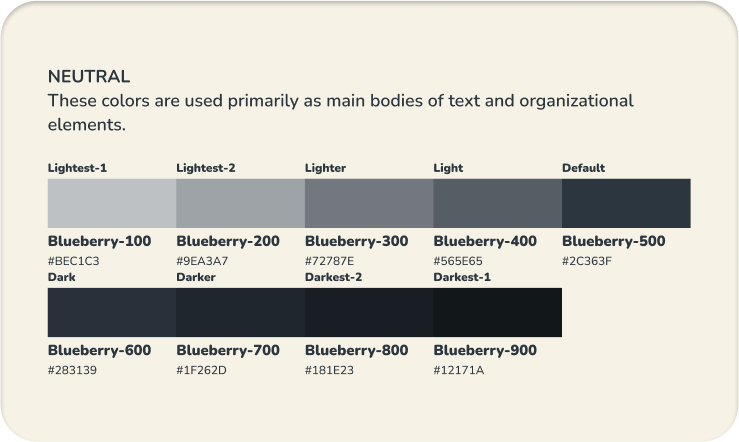
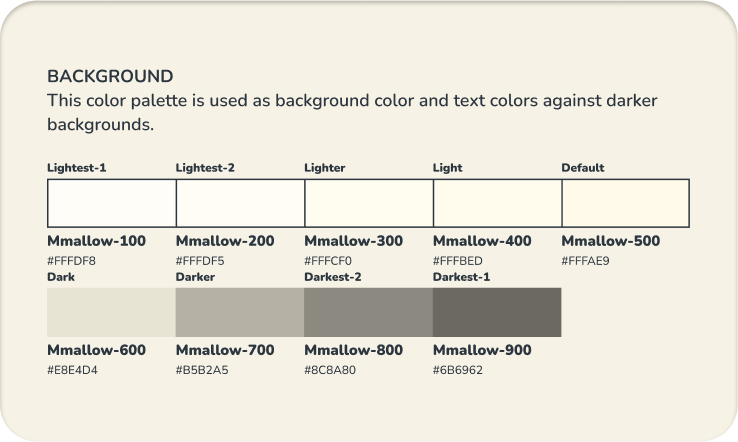
BRANDING
Crafting a visual identity
Many users expressed desire for personality and a better sense of business-customer connection. Since your brand is the first impression customers get from your business, I kept this insight at the forefront of my design decisions in creating a visual identity for Where You Bean.
05
SOLUTION
The key to keeping lattes hot and iced Americanos iced
After applying low-fidelity changes informed by the usability study and developing a fitting visual identity, Where You Bean was born.
OVERVIEW
OVERVIEW
OVERVIEW
OVERVIEW
OVERVIEW
OVERVIEW
OVERVIEW
OVERVIEW
OVERVIEW
OVERVIEW
OVERVIEW
OVERVIEW
OVERVIEW
OVERVIEW
OVERVIEW
Explore in your own way
Users, new and old, can choose to browse the full menu or let other customers’ picks guide their choice in beverage.
Returning users also has the option to re-order their past drinks and save time on customization.
Info-packed item descriptions
Nutritional info, allergens, and other customers’ feedback are provided for every item on the menu, that way customers can always place their orders with confidence.
Transparent item pricing
Live price updates ensure that customers’ modifications will always be met with transparency not surprises.
Checkout efficiently
Customers can check out quickly with just their name and phone number or choose one of their registered pick-up person. To save time on payment, customers have the option to pay using Google Pay, Apple Pay, or one of their previously saved payment methods.
Get live order updates
To ensure drinks are made fresh and on time, customers can notify baristas when they are nearby at any time within their arrival window. A progress card then keeps customers up-to-date on their order.
Help us help you!
An option to provide feedback is shown after customers receive their order to help baristas improve and to help inform future customer decisions.
PROBLEMS SOLVED
You thought it, we fixed it
01 HAVING LOGIN OPTIONS
Customers value having check-out options that best suit their situation. WYB ensures that whether a customer is new or returning, the option to check-out as a guest or sign-in/up will always be available to them.
02 INCENTIVIZING CUSTOMER RETURN
Customers felt that requiring users to create an account simply to place an order to be a hassle that lacks in benefits. Through a reward system and metric tracker, users will be able to build a sense of community while capitalizing on deals.
03 PERSONALIZING THE EXPERIENCE
The pandemic created a rift in community and a lack of connection caused users to feel a social disconnect with online ordering platforms. By “meeting” the barista, we are able to simulate a more personal and human experience.
04 AUTOMATION: QUICKLY RE-ORDER
Having to select the same drink customization every time they order left customers with an unnecessarily repetitive experience. By saving order history and creating the ability for us to re-order, WYB is able to simplify customers’ online ordering process.
04 AUTOMATION: PICK-UP INFO
Users found it bothersome to repeatedly fill out the same necessary information as a returning customer. To optimize the experience and reduce redundancy, WYB enables users with an account to save their pick-up info and auto-fill for future orders.
04 AUTOMATION: AUTO-FILL PAYMENT
Entering payment information was a source of frustration for many users. By providing customers the option to use their digital wallet or manually saving a new method of payment, WYB can prevent users from having to enter their credit card info again for the 13th time.
06
CLOSING THOUGHTS
Learnings & Limitations
Being directly involved in transforming Where You Bean from a concept to a complete product allowed me to thoroughly examine the prevalent issues with existing online ordering systems. While having design ownership came with its own challenges, it was incredibly valuable to develop solutions that addressed the problems many users faced during the pandemic and continue to solve ongoing issues today.
DON’T GET TOO EMOTIONALLY ATTACHED TO ONE IDEA
In the first iteration of lo-fi prototyping, it was easy to get attached to an idea or design. As the prototype underwent usability testing, many flaws were uncovered and I quickly had to realize that ideas are meant to come and go. At the end of the day, “good” design serves no purpose if it increases hurdles in usability.
exploring the effects of design decisions on the business end
Given the limited time frame, we focused on addressing the most commonly identified user frustrations and prioritized creating user-centered deliverables. However, with additional time and flexibility, I would explore the impact of our design decisions on the business side (e.g., how optional user login and contact information affect company reach and user engagement).